From Report Builder to Stimulsoft: Modernizing Manufacturing Reports in a Cloud-Native World
When we set out to migrate our Operational Data Store (ODS) from SQL Server to ClickHouse, we knew the ripple effects would extend far beyond the database layer. Our entire reporting infrastructure needed a rethink. What started as a database migration evolved into a comprehensive modernization of how we deliver information to manufacturing operations.
Why We Had to Move
Two driving forces converged to make migration inevitable:
The ClickHouse shift. As we detailed in our previous post on the ClickHouse migration, moving to ClickHouse brought performance improvements for analytical workloads. But Microsoft Report Builder and SQL Server Reporting Services (SSRS) were built for the SQL Server ecosystem. While technically possible to connect SSRS to other data sources, it’s not where the platform shines.
The Kubernetes reality. Our infrastructure is largely containerized and orchestrated by Kubernetes, though we still run our SQL Server databases in VMs. SSRS, however, comes from a different time, one of Windows Servers and IIS. Forcing SSRS into our cloud-native architecture would have been fighting against the current. We needed a reporting solution that embraced modern deployment patterns: containers, horizontal scaling, and cloud-agnostic infrastructure.
The Evaluation Process
We didn’t rush into selecting a replacement. Manufacturing systems demand reliability, and our reports are mission-critical for operations, quality control, and compliance. Our evaluation criteria included:
• Data source flexibility: Native or robust support for ClickHouse, plus the ability to consume OData feeds. Our data access strategy centers on OData exposed through our DataManager component and DataSet system entity type, so seamless OData integration was essential
• Kubernetes-friendly deployment: Docker containers, stateless architecture, and straightforward orchestration
• Report design capability: A designer that wouldn’t feel like a significant step backward from Report Builder
• Export formats: PDF, Excel, and other formats commonly needed in manufacturing
• Migration path: How difficult would it be to convert existing reports?
• Licensing and cost structure: Predictable costs that scale with our needs
After evaluating several options (including open-source alternatives and commercial platforms), Stimulsoft emerged as the best fit. It checked all our technical boxes: native ClickHouse support, robust OData connectivity, runs in containers, and offers a report designer that our team could adopt without a steep learning curve. The JS-based architecture also aligned well with our existing technology stack. An additional advantage was our existing familiarity with Stimulsoft. Our PrintableDocuments module had already been implemented using the same tool, which meant we had proven experience with its capabilities and understood its strengths and limitations in a production environment.
The reality of the market. Let’s be honest: printable reports aren’t sexy. The developer community has moved on to dashboards, real-time visualizations, and interactive analytics. Open a tech conference schedule or browse GitHub trending projects, and you’ll find dozens of dashboard frameworks but very few modern reporting tools. The market for traditional report designers has shrunk considerably. Most innovation and investment flows toward tools like Grafana, Tableau, and Power BI, not toward PDF generation engines. This made our evaluation more challenging than expected. The options were limited, and many tools felt dated or were poorly maintained. Finding a modern, actively developed reporting solution that fit our cloud-native architecture required looking harder than we anticipated.
Why Printed Reports Still Matter in Manufacturing
With real-time dashboards and interactive analytics becoming standard, you might wonder: why invest in traditional reports at all? Why not just build everything as a Grafana dashboard?
The reality of manufacturing operations tells a different story. Here’s why printable reports remain essential:
Compliance and audit trails. Regulated industries require signed, dated documentation. A PDF report with formal approval signatures is often legally required. You cannot simply attach a compliance officer’s signature to a dashboard.
Material documentation. When a material or production batch is complete, you need a comprehensive, frozen-in-time record of what happened. That batch report needs to travel with the material, be archived for years, and be reproducible exactly as it was generated. Dashboards are dynamic; reports are immutable.
Offline accessibility. Shop floor environments don’t always have reliable network access. A printed report or a PDF on a tablet works anywhere, anytime. When a quality inspector is in a warehouse or on a production line, they need information at their fingertips, not behind a login screen.
Formal communication. Some information needs to be packaged formally: reports sent to customers, presented to management, or submitted to regulatory bodies. A well-formatted PDF report conveys professionalism and authority in ways a dashboard screenshot simply cannot.
Complex, detailed layouts. Some manufacturing reports contain dense tables, detailed specifications, and precisely formatted information that spans multiple pages. These are better suited to the document paradigm than dashboard tiles.
The key is: dashboards and reports serve different purposes. They’re complementary, not competing approaches to data visualization.
Implementation: Migrating the Report Portfolio
With Stimulsoft selected, the real work began: migrating existing reports from Report Builder’s RDL format to Stimulsoft’s MRT format.
No magic conversion button. The hard truth is that there’s no automated way to convert RDL files to MRT. Each report required manual recreation. However, this wasn’t entirely bad news; it forced us to examine each report and consider whether it still served its intended purpose. For example, our Material Yield Information report, which was paginated in SSRS, evolved into a Yield Loss Information dashboard in Grafana, better suited to real-time monitoring than static reports.
Leveraging familiar concepts. Stimulsoft’s designer feels familiar to anyone who’s used Report Builder. Concepts like datasets, parameters, groups, and expressions translate cleanly. Our team could open an existing RDL report in Report Builder, have Stimulsoft designer open alongside, and reconstruct the report with reasonable efficiency.
Data source adaptation. Every query needed review. Moving from SQL Server to ClickHouse meant adapting SQL dialects, rethinking some join strategies, and occasionally restructuring queries to leverage ClickHouse’s columnar strengths. In some cases, we discovered opportunities to dramatically improve performance by rewriting queries with ClickHouse’s capabilities in mind.
Template standardization. The migration presented an opportunity to create standardized templates (headers, footers, color schemes, and typography) that could be reused across reports. Consistency in our previous Report Builder environment was not our biggest strength, with each report often having its own visual style and branding approach.
Design Improvement
If you’re going to recreate reports, you might as well make them look better.
Our old reports had accumulated over years, created by different people with varying skill levels and design sensibilities. Let’s just say that some reports looked like they were designed by someone who thought Times New Roman was a perfectly reasonable font choice, while others appeared to have been assembled by developers who believed that if gray text on a gray background was good, then slightly different gray text on a slightly different gray background was even better. And don’t get us started on the creative interpretations of our corporate blue. Some of our reports featured what can only be described as “fifty shades of blue,” ranging from navy to cyan, with each developer using their own personal definition of what “blue” meant.
Some looked professional; others were purely functional. The migration gave us a chance to apply consistent design principles:
Visual hierarchy and white space. Many legacy reports crammed information into every available pixel. We introduced breathing room, clearer section breaks, and better use of typography to guide the reader’s eye.
Consistent branding. Color schemes, logos, and font choices now align with our corporate identity across all reports. This sounds superficial, but it matters when reports are customer-facing or presented to executives.
Data visualization improvements. Where we previously relied on tables alone, we introduced charts and sparklines to make trends more obvious at a glance. Not every report needs to be a wall of numbers.
Better parameter interfaces. The UI for selecting report parameters (date ranges, facilities, product lines) received attention. Clearer labels, better defaults, and logical grouping make reports easier to run for operations staff.
Before and After: A Visual Comparison
The transformation is best seen rather than described. Below is a side-by-side comparison of one of our production reports:
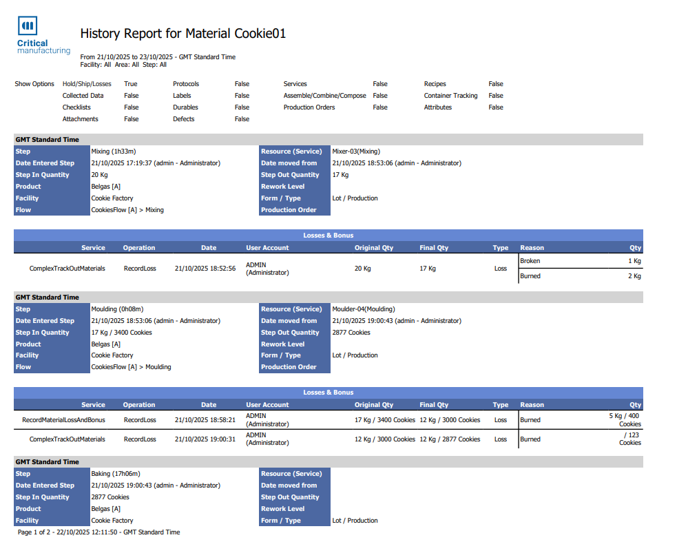
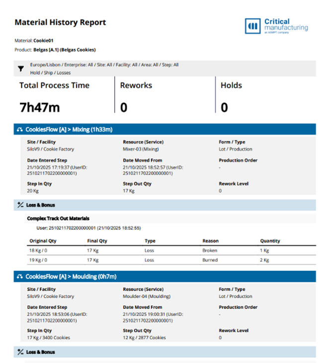
The old version is functional but dense, with inconsistent spacing, color saturation, and weak visual hierarchy. The new version breathes, guides the eye naturally through the information, and presents the same data in more readable and organized layout.
Credit where credit is due: our design team worked wonders throughout this migration. They took reports that had been cobbled together over years by different developers and transformed them into polished, consistent documents. In some cases, the underlying data structure or business logic made a design challenging. Sometimes the team had to put lipstick on a pig, and they did it well. Not every report can be a masterpiece when the data itself is complex and unglamorous, but they managed to make even the most utilitarian reports look readable, functional, and visually attractive.
Dashboard vs. Report: Making the Cut
The migration forced an important strategic question: which of our existing reports should actually remain as reports? We conducted a systematic review of our entire report portfolio, asking:
• Is this information needed in real-time? If yes, it probably belongs in Grafana.
• Does this need to be printed, signed, or archived? If yes, it stays as a report.
• Is this primarily for exploration and investigation? Dashboards excel here.
• Is this a formal, structured document? Reports are the right choice.
• How often is this actually used? Some reports existed simply because they always had.
The result was a rationalization of our information delivery strategy:
To Grafana: Real-time production monitoring, live equipment status, ongoing quality metrics, and anything operators need to watch continuously. These became interactive dashboards where users can drill down, filter, and explore.
To Stimulsoft: Batch documentation, compliance reports, shift summaries, monthly production reports, and anything requiring formal structure or offline access. These remained as traditional reports.
To retirement: Quite a few reports that nobody had run in years. Migration is a great time to kill zombie reports that exist only out of inertia.
This clarity (knowing what belongs where) has made both our dashboards and our reports more focused and effective.
Lessons Learned
Looking back on the migration, a few key insights stand out:
Forced migrations create opportunities. Yes, we had to migrate because of technical necessity. But framing it as an opportunity to improve, not just replicate, made the effort worthwhile.
Don’t underestimate design time. Recreating reports takes longer than you think, especially if you’re improving them along the way. Budget accordingly.
Involve end users early. We previewed redesigned reports with the people who actually use them. Their feedback was invaluable and sometimes surprising.
Containerization pays dividends. Deploying Stimulsoft server in Kubernetes has been smooth. Scaling, updating, and managing the infrastructure is straightforward in ways SSRS never was.
SQL dialect matters. If you’re changing databases as part of your migration, don’t underestimate the query rewriting effort. ClickHouse and SQL Server speak similar but not identical languages.
The best report is the one that gets used. If nobody runs it, it doesn’t matter how well-designed it is. Be ruthless about eliminating unused reports.
Moving Forward
The migration continues, and our manufacturing operations are transitioning to a modern reporting infrastructure: ClickHouse for data storage, Stimulsoft for formatted reports, and Grafana for real-time dashboards. Each tool plays to its strengths. We are currently running both old and new reports in parallel as we methodically work through the portfolio, ensuring each migrated report meets our quality standards before we retire its predecessor.
The transition from Report Builder to Stimulsoft is giving us the opportunity to rethink how we deliver information in a manufacturing context. The reports we’ve completed so far demonstrate the benefits: faster performance, clearer visual design, and an infrastructure that fits our cloud-native architecture. The work continues, but the direction is clear and the results are promising.
For teams facing similar migrations, our advice is simple: embrace the opportunity and don’t just recreate what you had. Build what you need for the future. And be realistic about the timeline; this kind of transformation takes time, but it’s time well spent.